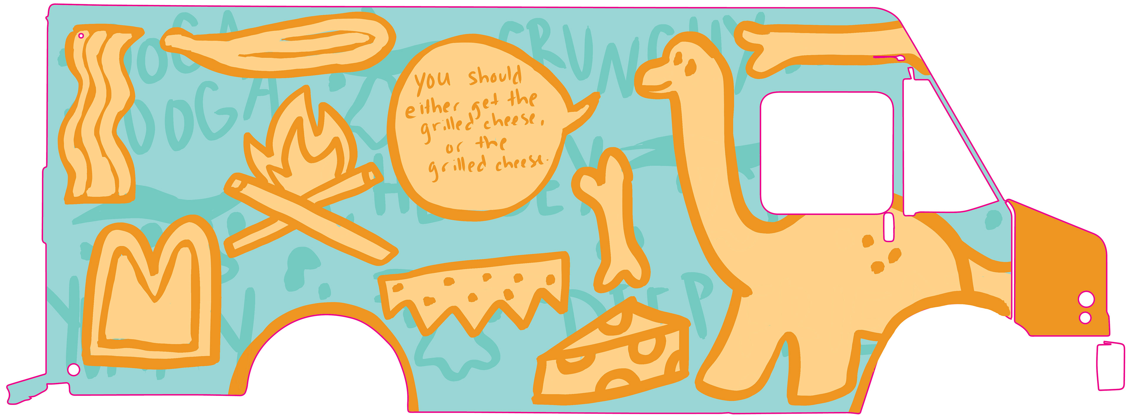
CRAVEMAN FOOD TRUCK
This food truck needed a desperate rebrand. The original branding felt suck in the past. My rebrand helped make the branding stand out, emphasizing the fun, playful themes and letting customers know exactly what they're looking at. The branding is simple yet effective, allowing the branding to expand to feature future changes.
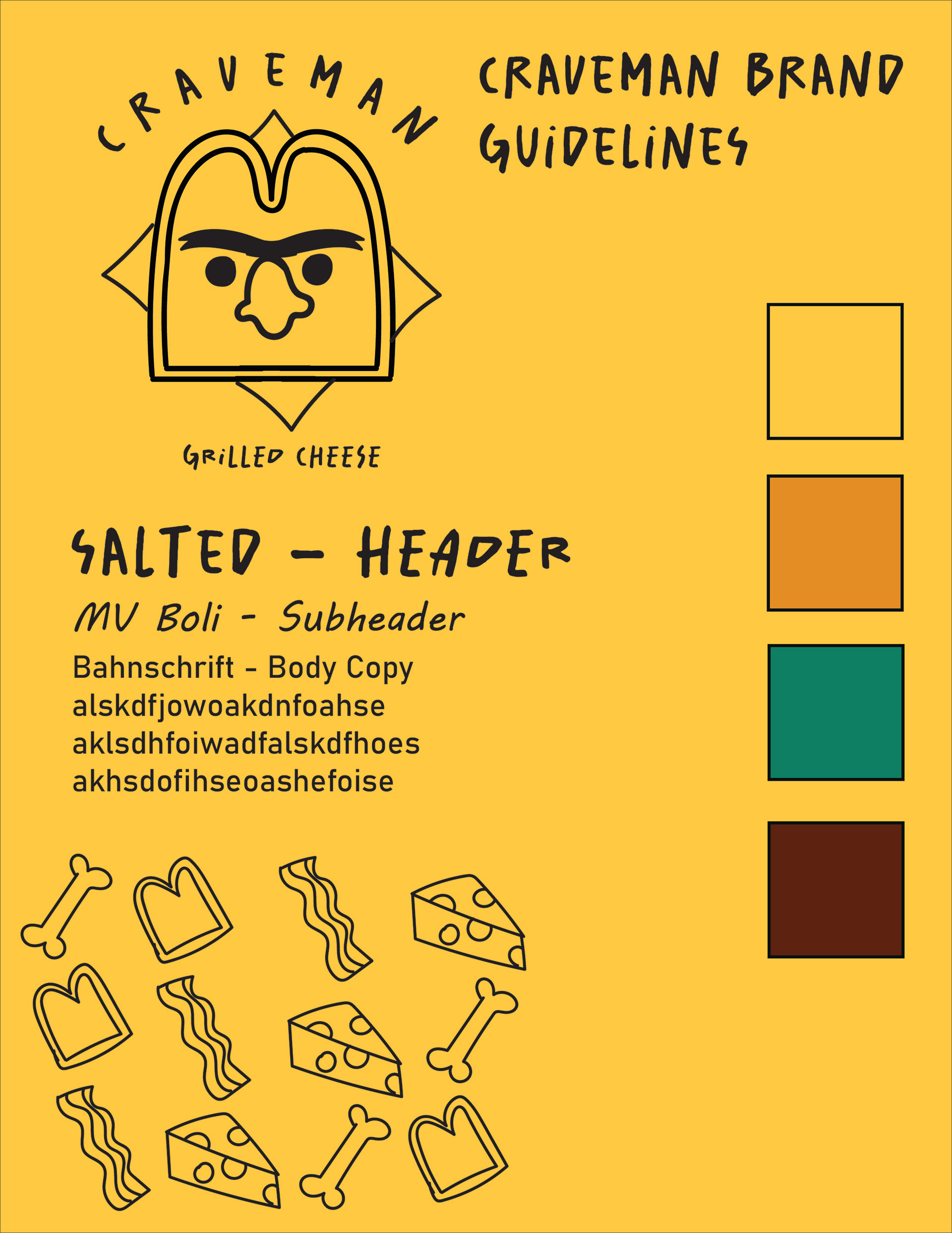
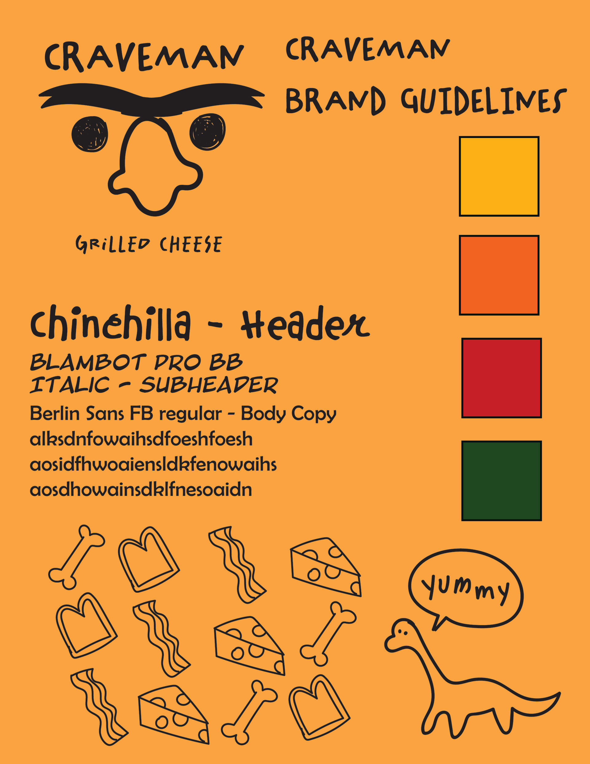
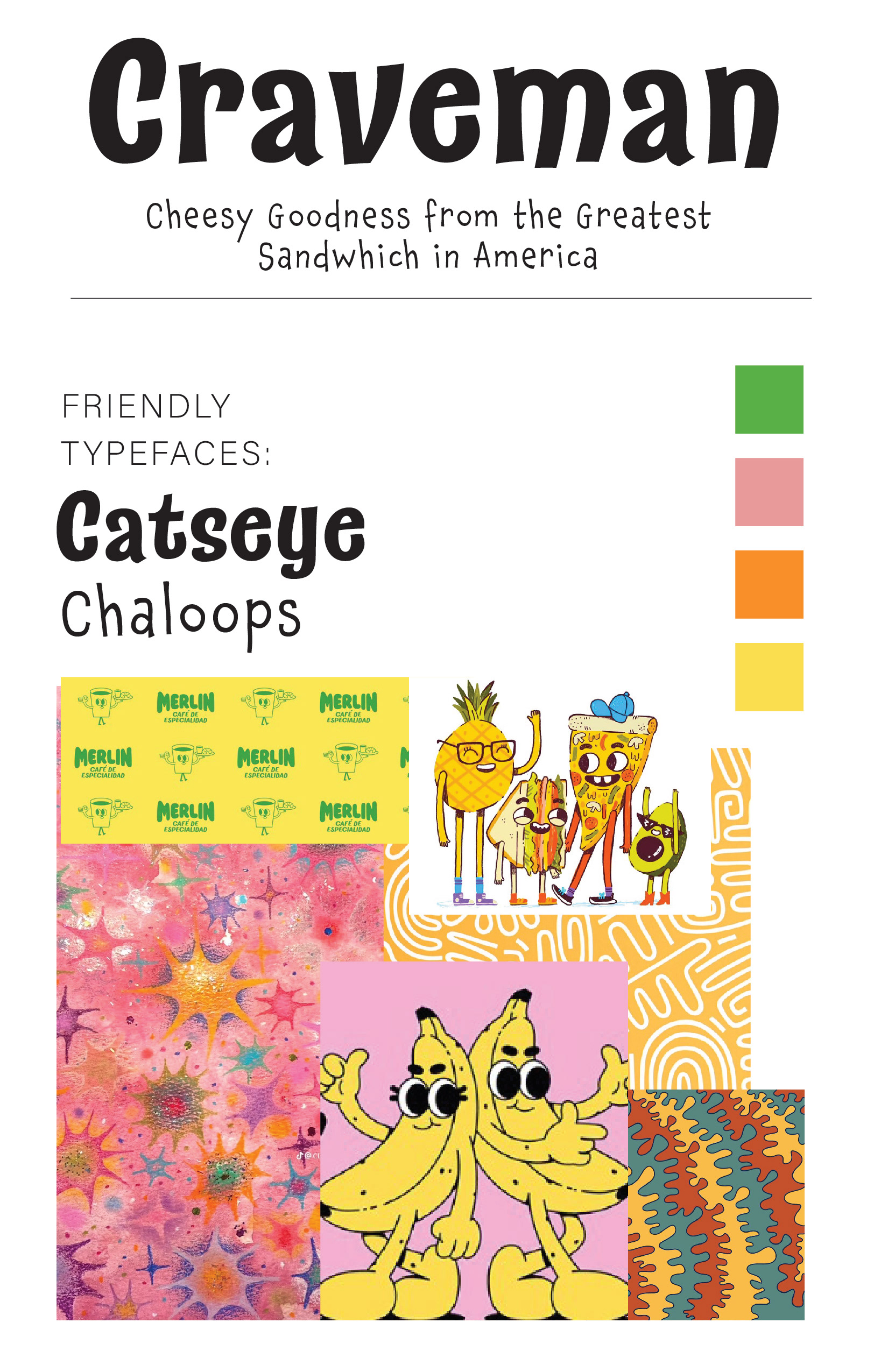
The branding guidelines allow for a fun and feisty feel, showcasing the grilled cheese directly while also maintaining the caveman theme.
The branding is fresh, fun, and stands out in a crowd.
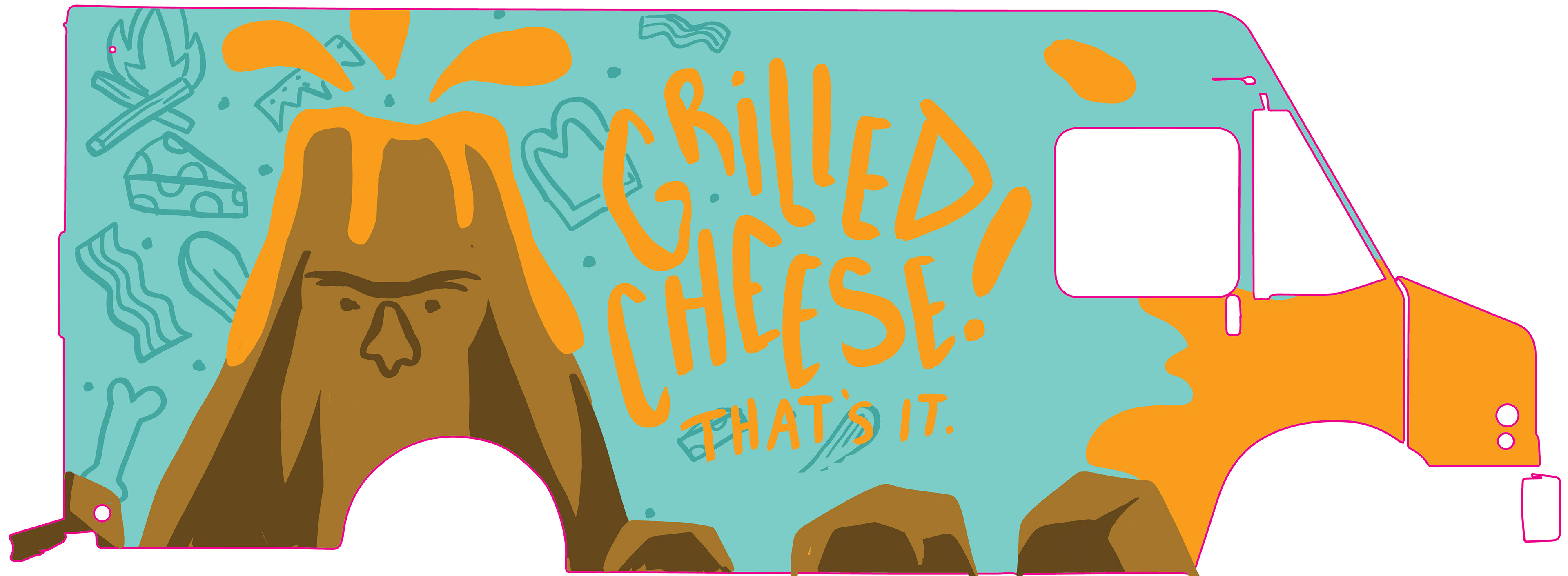
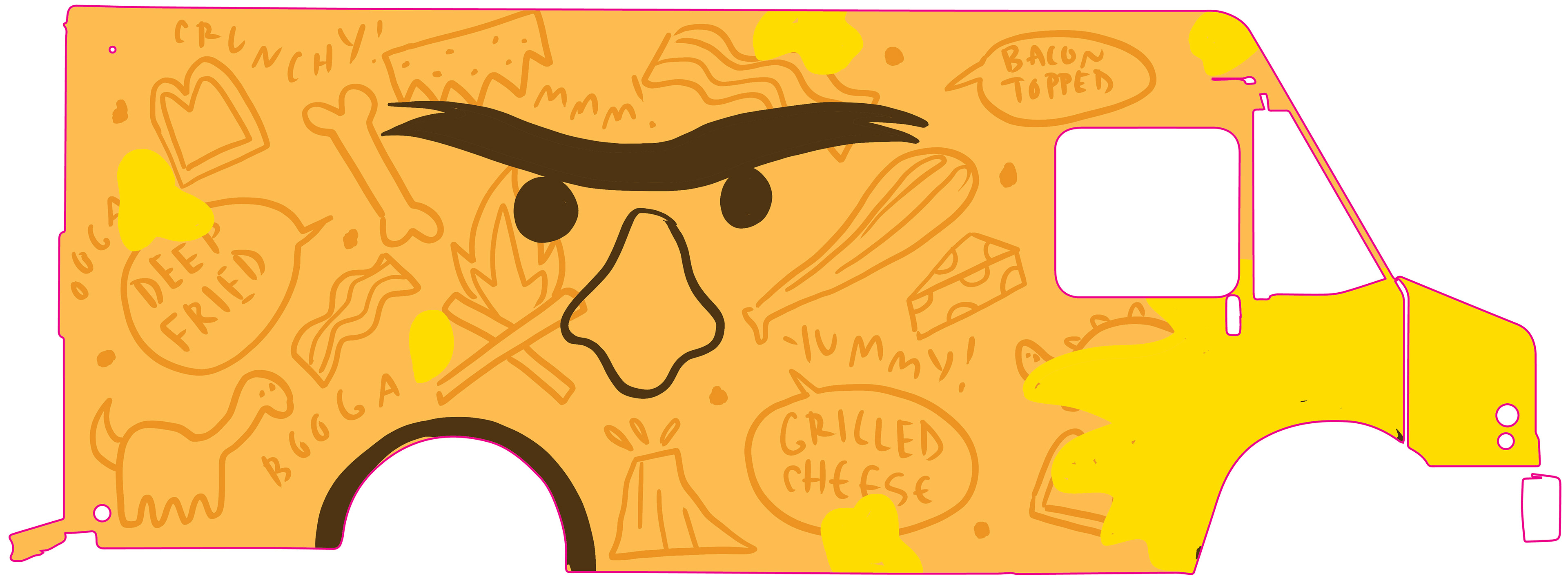
The branding is reflected in the designs blow.
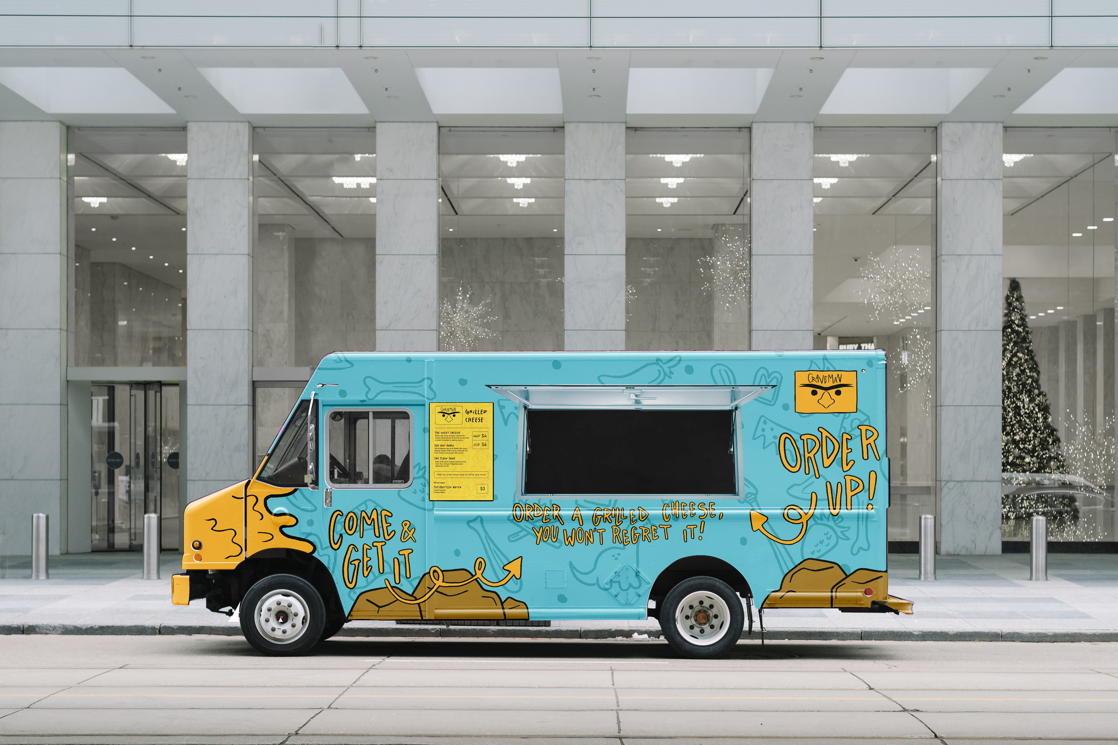
Left side of truck
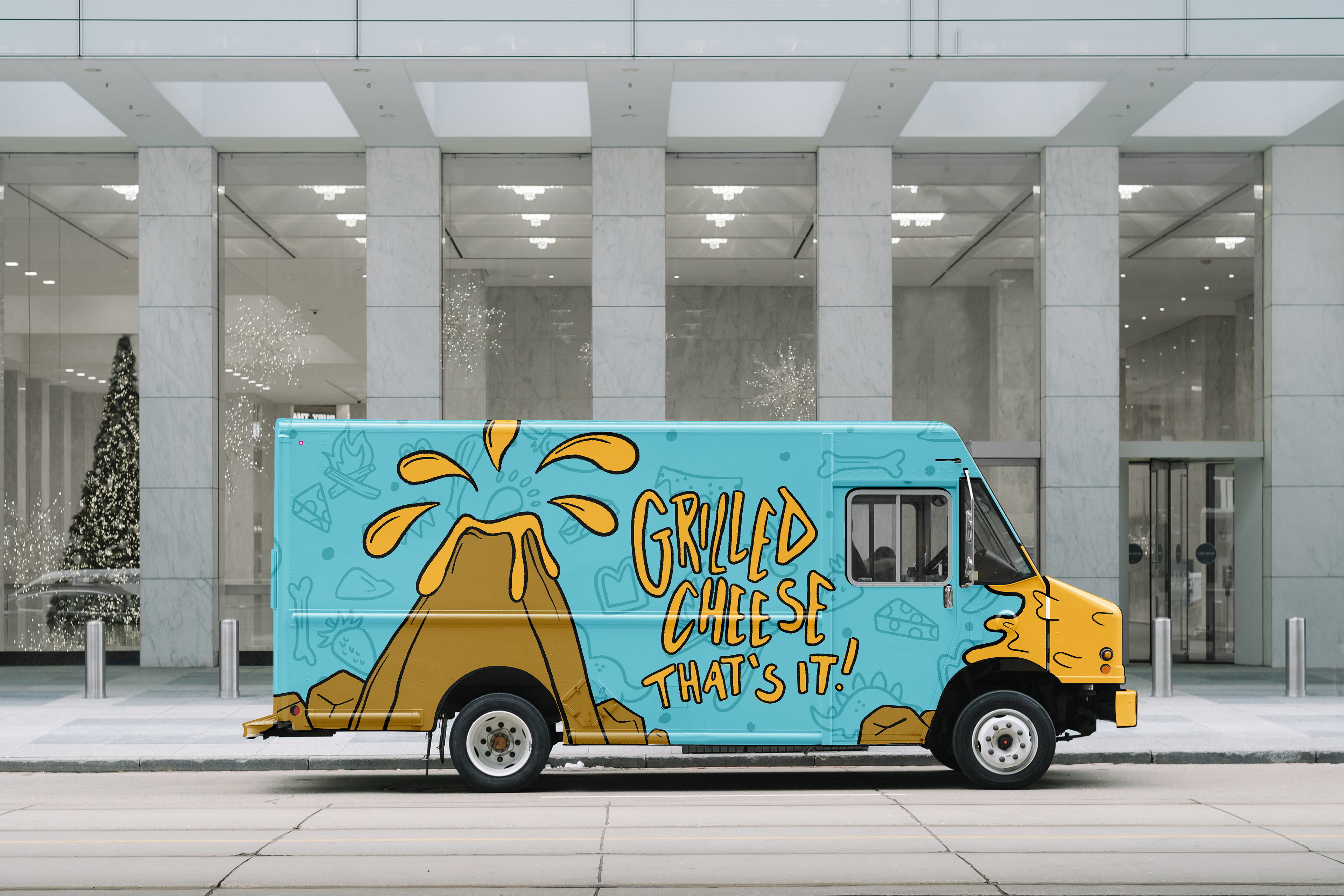
Right side of truck
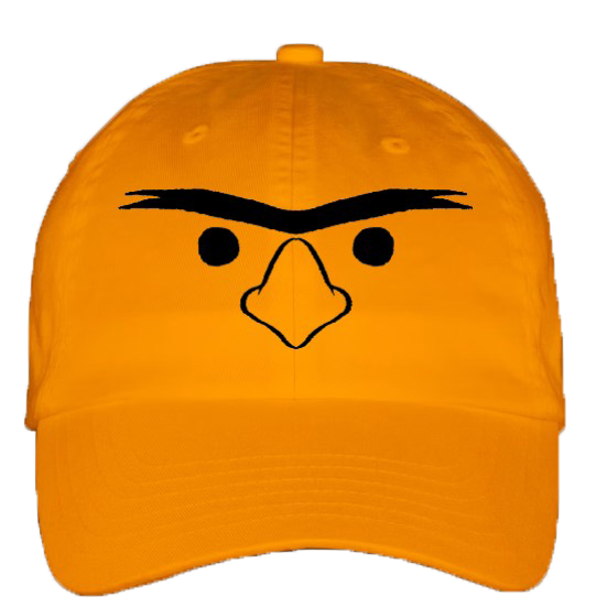
Hat
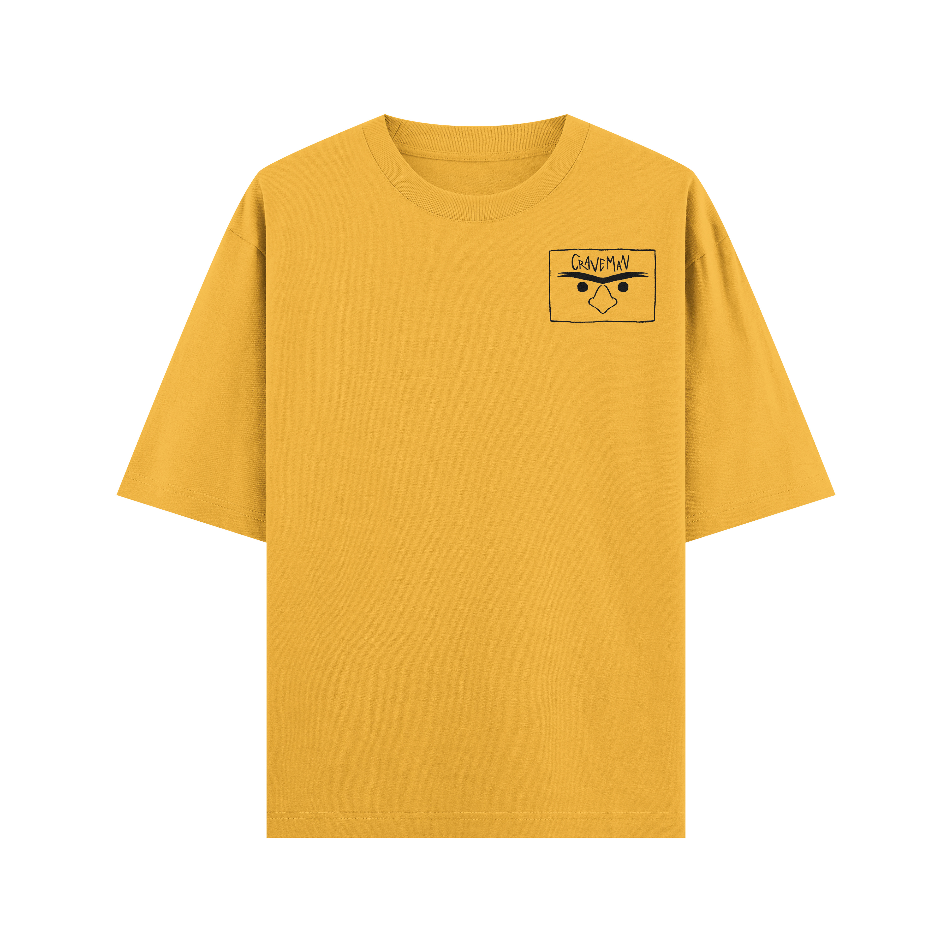
Logo shirt
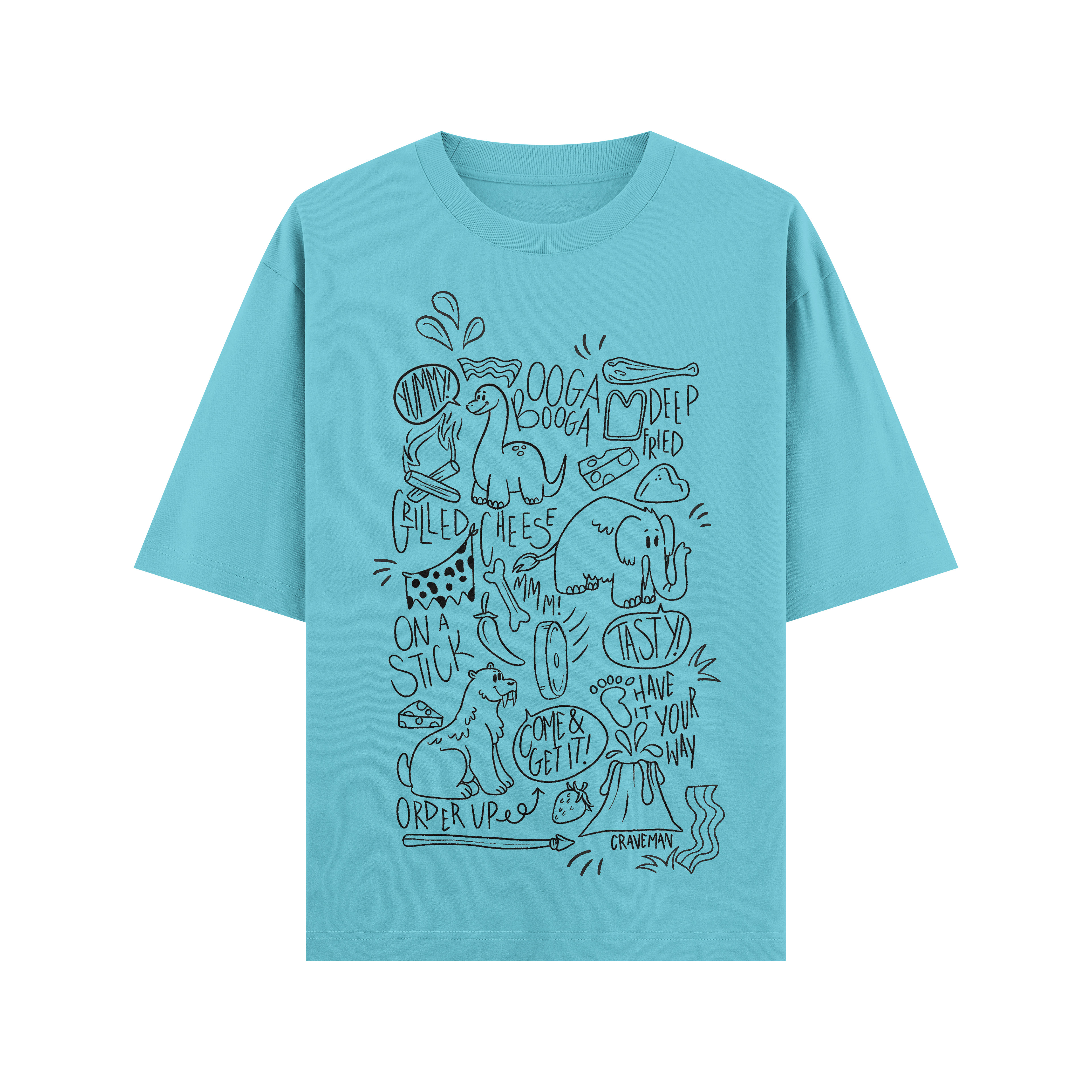
Pattern shirt
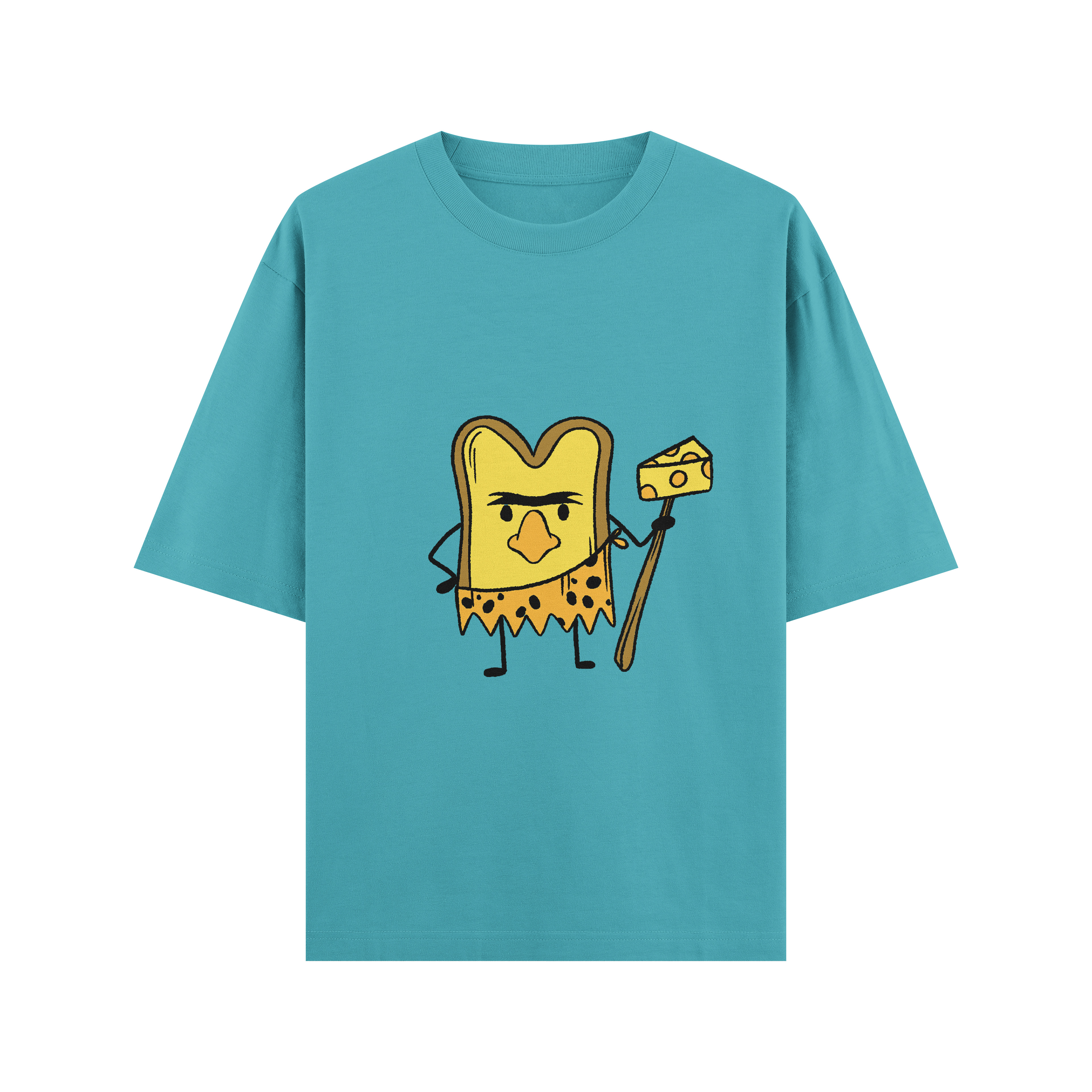
Fun mascot shirt
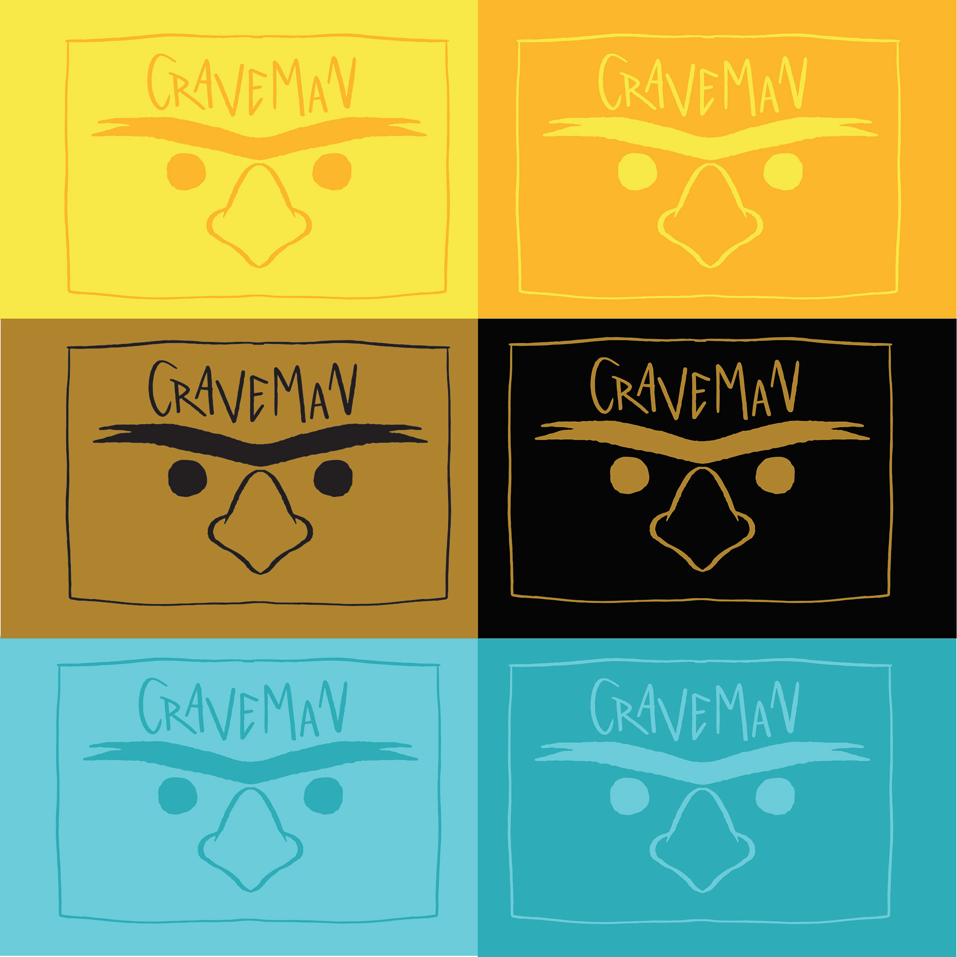
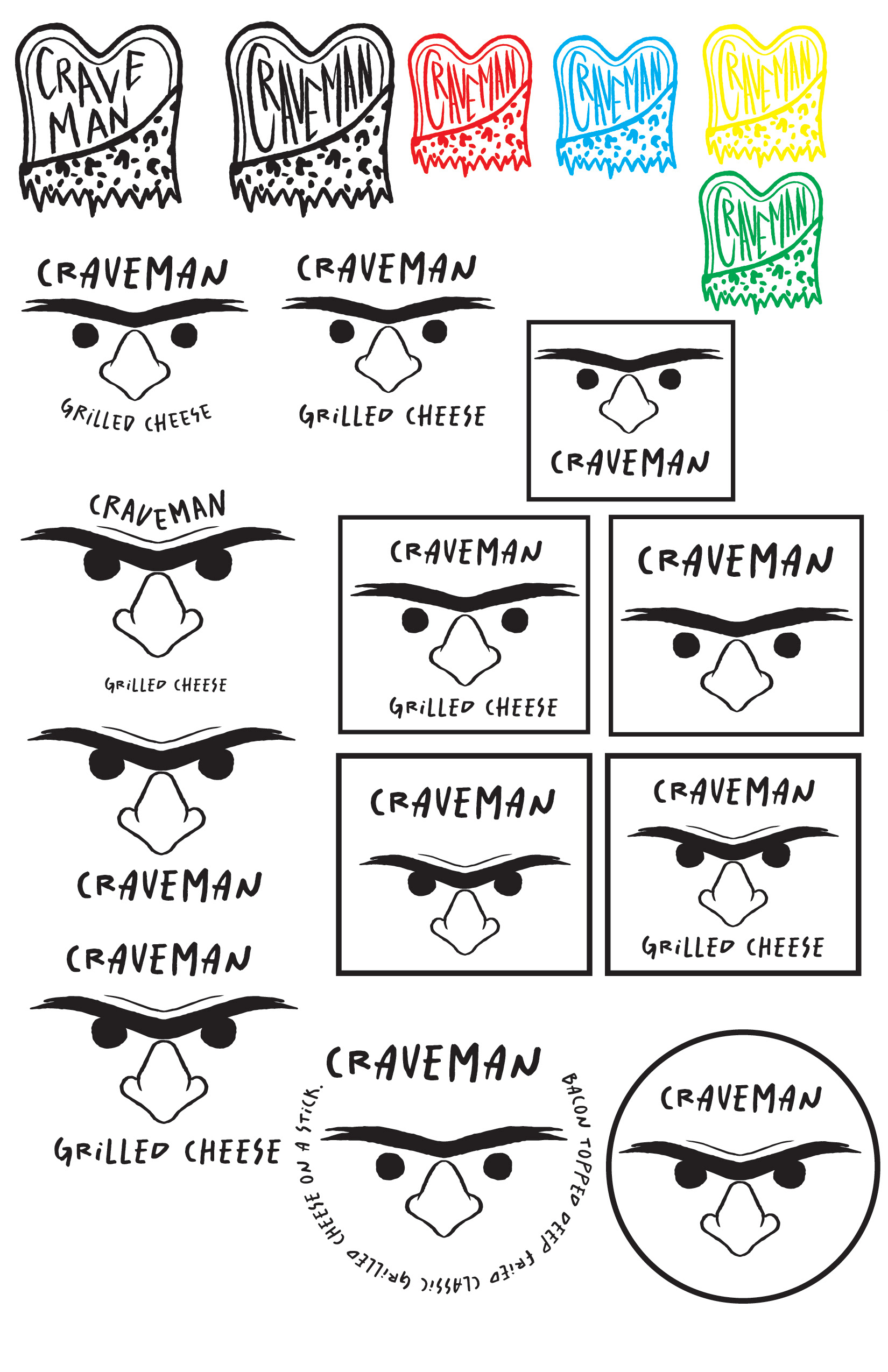
Logos
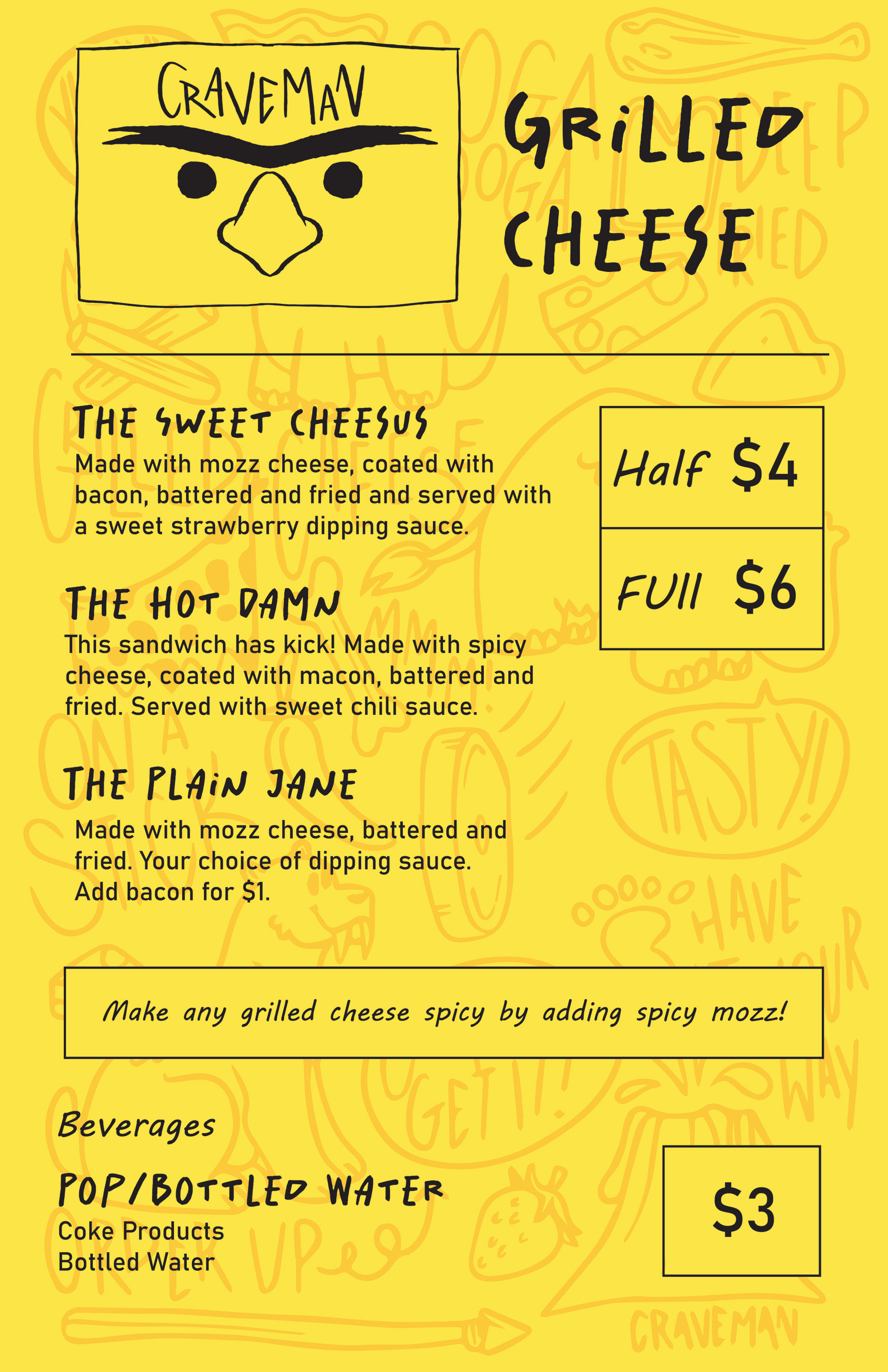
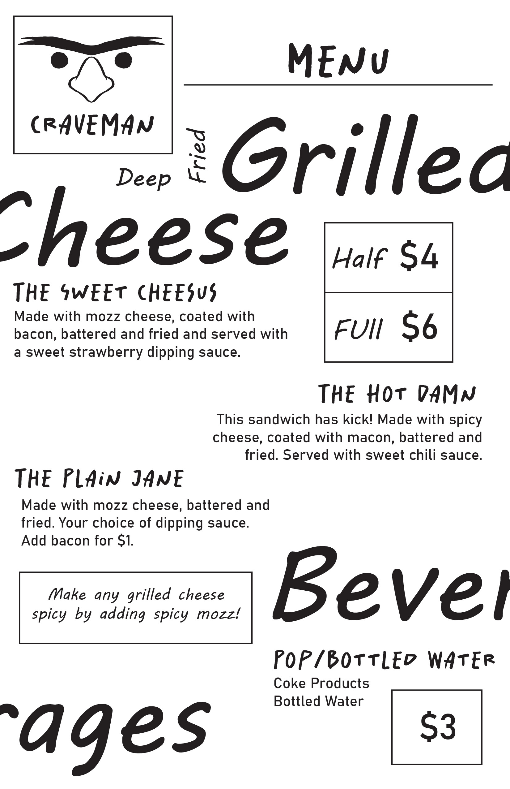
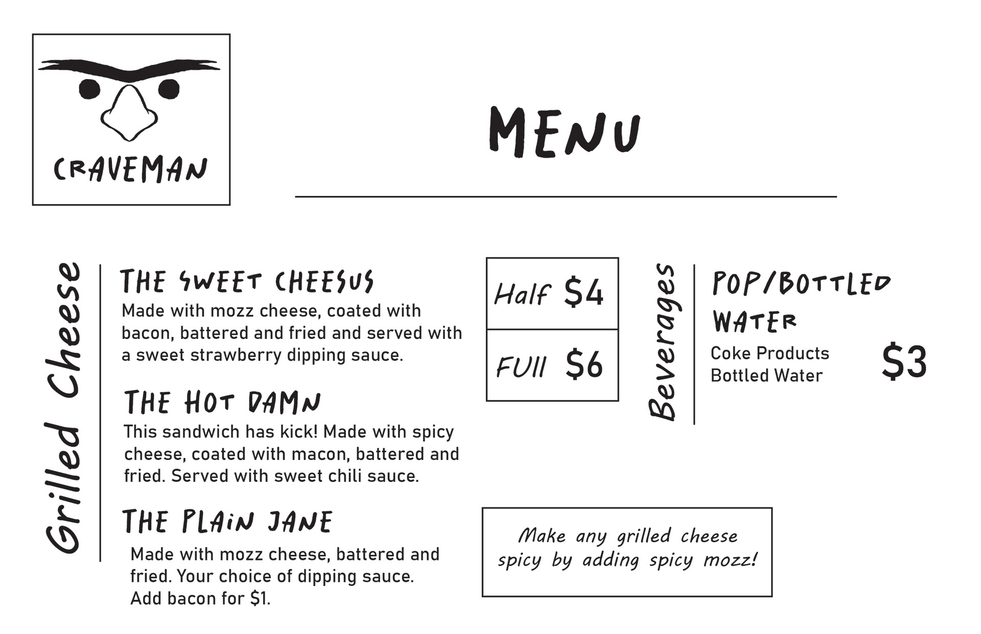
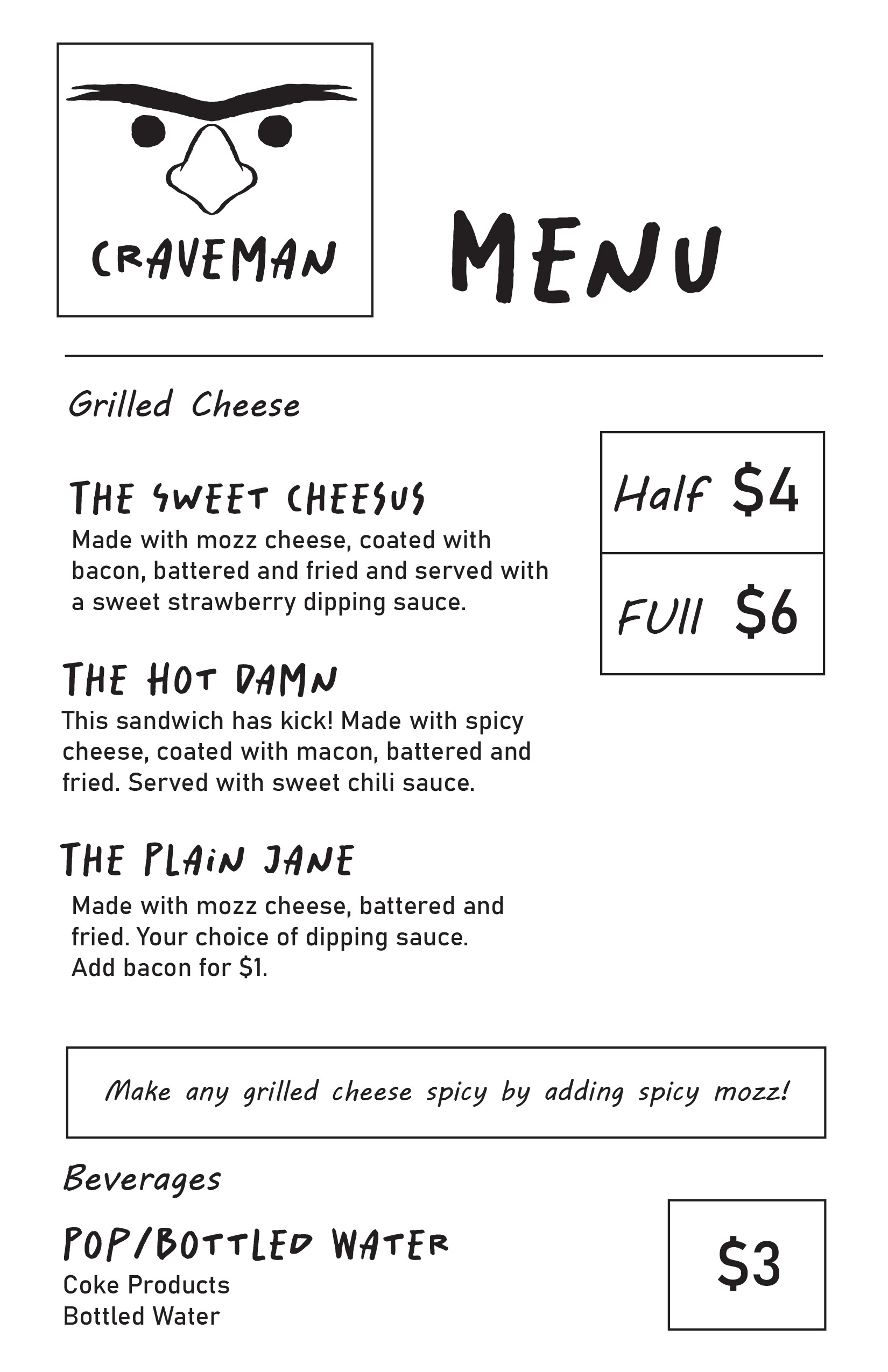
Menu
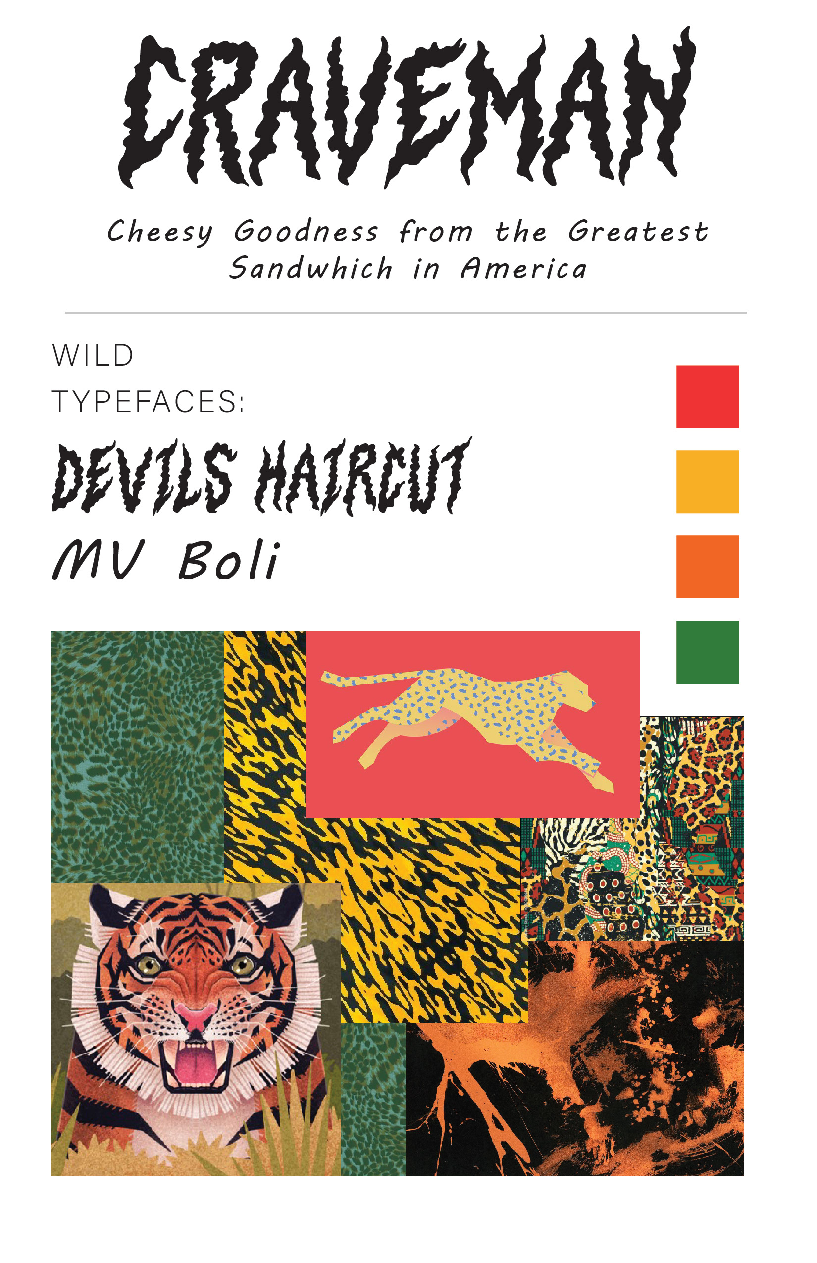
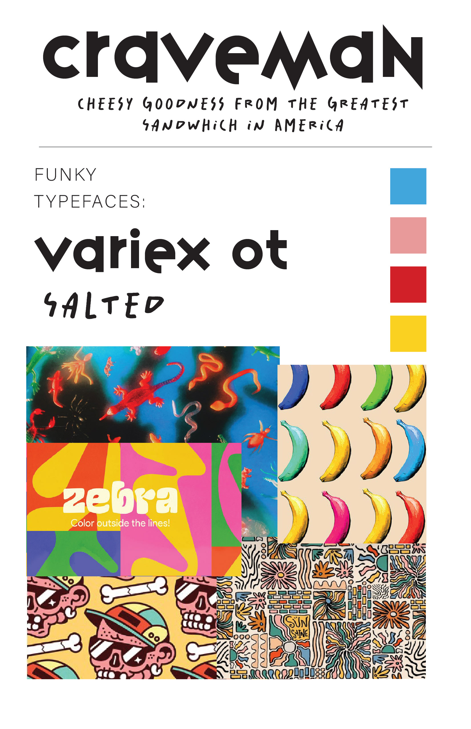
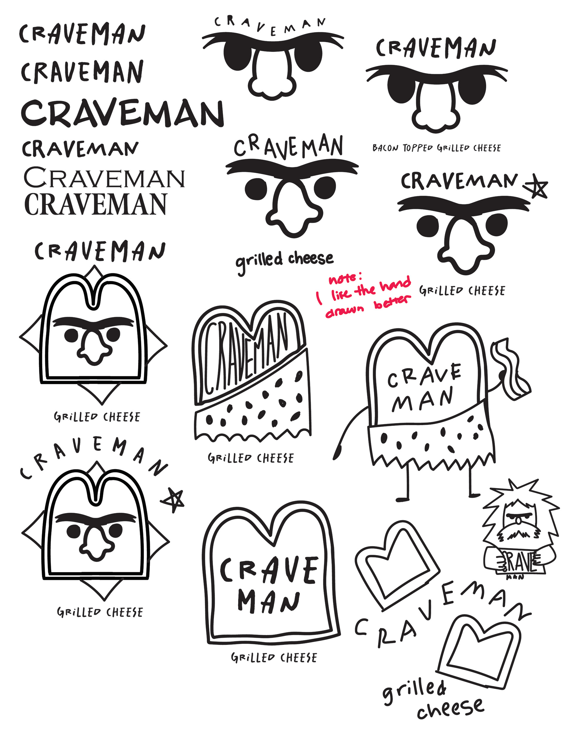
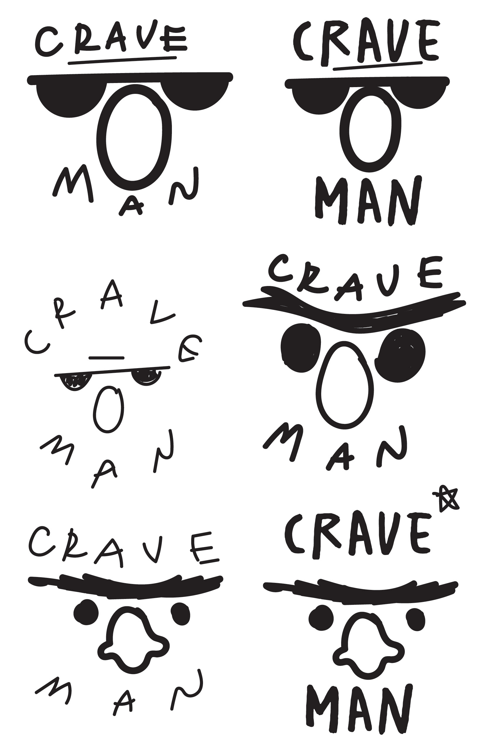
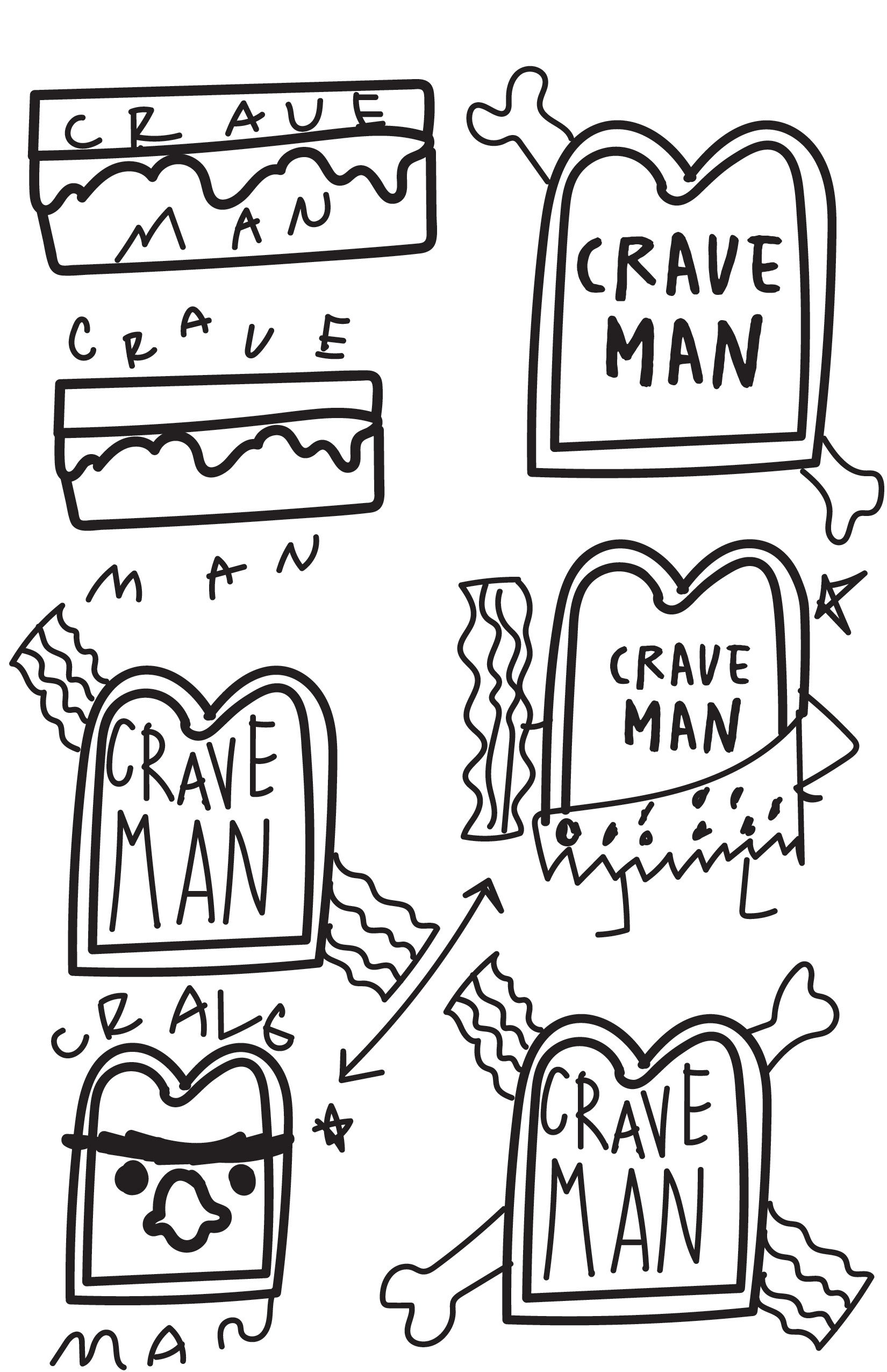
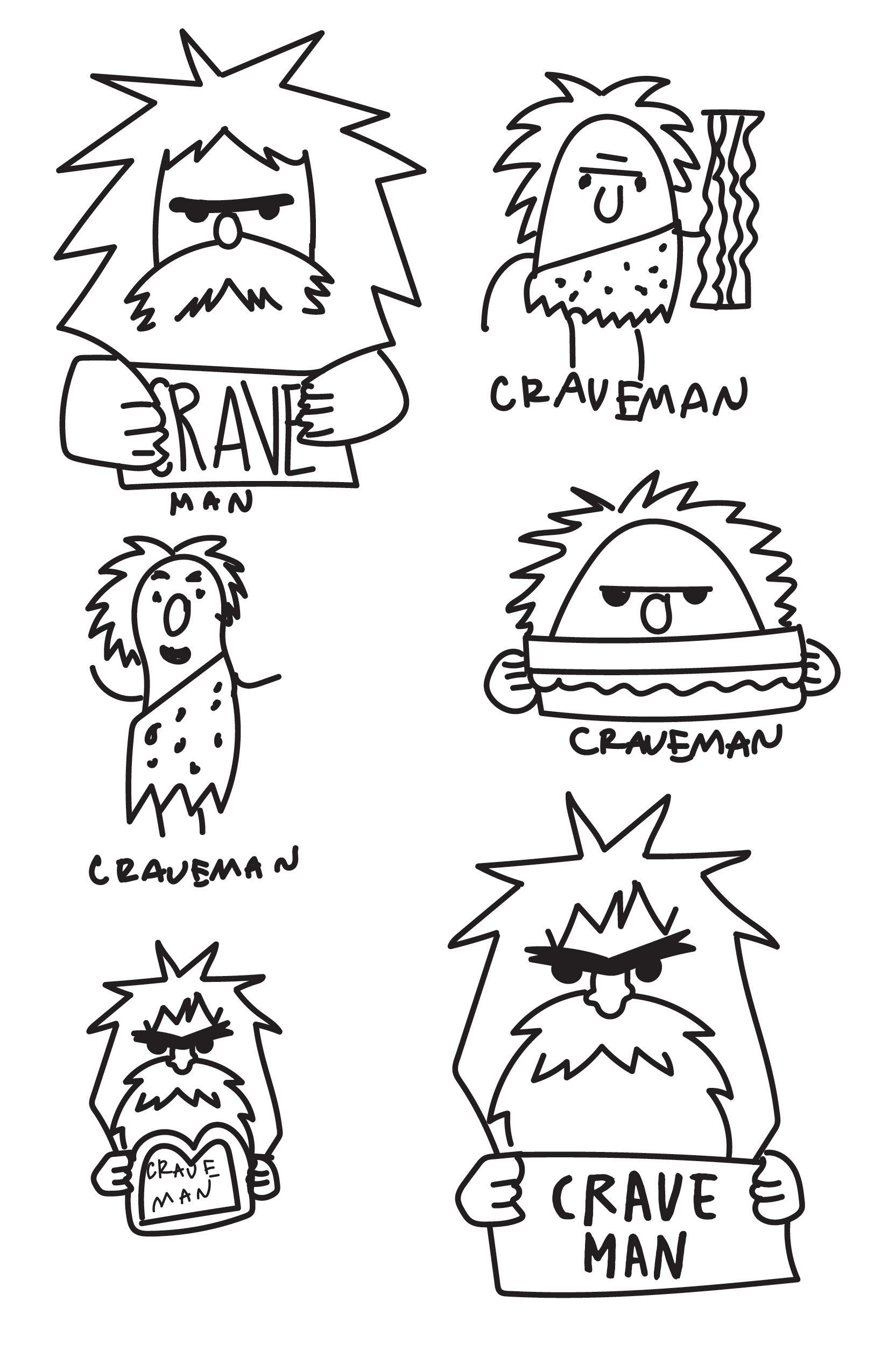
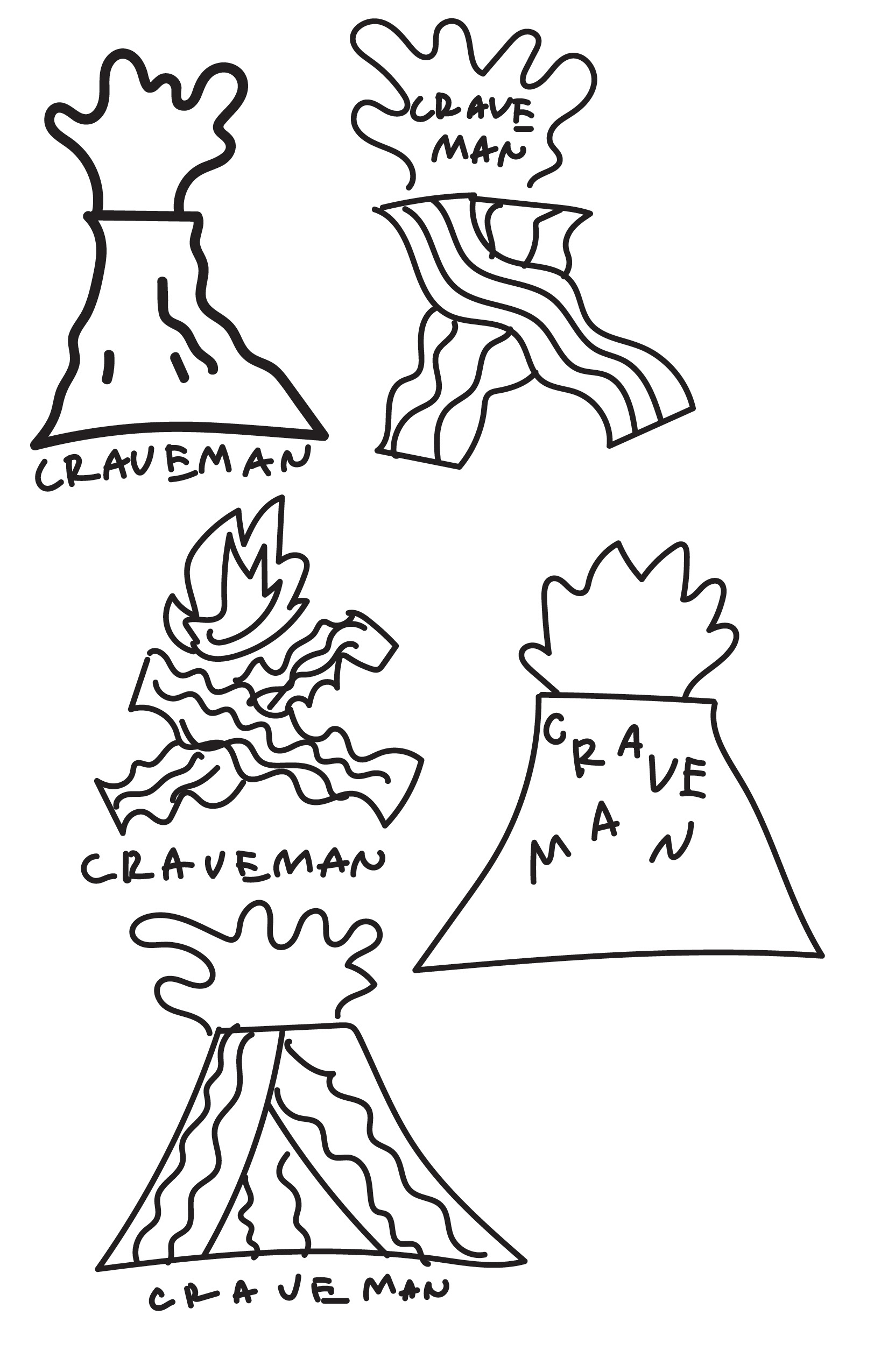
Now you've seen the new branding, but how did we get here? Through a variety of trial and error, trying new things, and experimentation, I managed to get to the final direction. Below are the remains of the initial ideation stage and the experimentation stage!
